michelle quesada architect
Welcome
I am looking forward to meeting you and starting our conversation about your Project.
Please browse these photos - behind each is a good story; each began with a conversation.
None were possible without a clear plan and excellent collaboration.
Welcome!

The Nautilus is my Inspiration. This creature can respond instantly to its environment, thanks to the geometry around which its shell, its home, is organized.

A breathtaking room, transformed from a spare room to a place of graceful repose.

Twin vanities flank the entry to the Bathroom.

Working with non-negotiable existing elements insures a successful project. Windows, radiators and 2x4 floor structure-the challenge sparked creativeness.

Timeless.

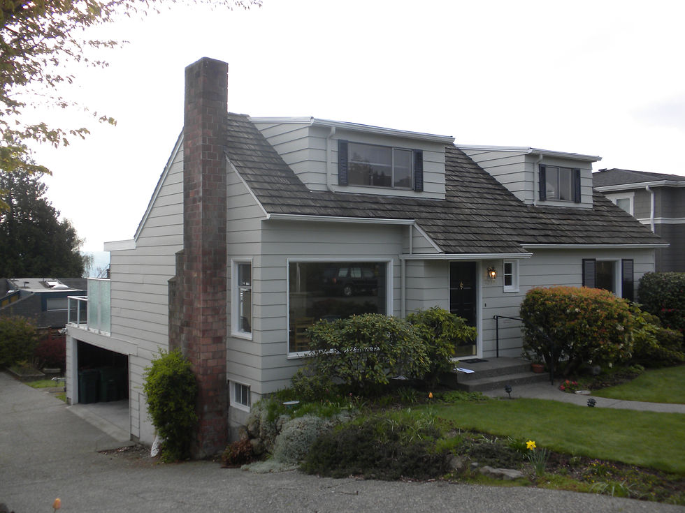
This is a before photo. Our work included removing the existing half story, plus an addition to the back of the house, and renovating all existing spaces.

Here you can see the new Second Floor. We added a sweet entry roof and craftsman style trim.

Entrance close up. The carpenter's work is superb.

Note the brackets, the dentils. The look of the house was completely transformed.

A sweet detail shot of the screen door rail.

Turns out that the first Little Pig was right... Working closely with King County, this house represents months of collaboration with officials to permit the first Straw Bale Home in the County. There was a contingent that visited the site regularly, impressed with the materials, the building process and the results.

Some clear finished wood adds a nice contrast to the site-produced exterior plaster.

This Garden Shed was built at the UW, then tested for a year for moisture within the Bales. The Straw remained under the required maximum moisture level of 19%.

The Straw can be carved to soften the way light enters an opening.

The Truth Window, a tradition in straw bale homes.

This is a before photo!

Expanding into a spare room, the Bathroom becomes an event.

Same home, another before photo. The window remained as is, but we removed the adjacent wall.

Without the wall, the Kitchen becomes a place to cook, gather with friends, and relax.

Here is the same Kitchen, from the opposite direction. Glass cabinets allow light to pass through to and from the Kitchen and Dining Room.

Pool delivery! The unit was craned over the house and gently placed in the Basement. Great teamwork, as you can imagine, was the key.

Here's the installed pool. A path of pebbles leads to the backyard deck.

Adjacent to the Pool: a Sauna and Exercise Room.

Ready for a workout.

After exercising, relax with the Family.

The spectacular view is framed by an existing window.

Our client is an avid chef. Cooktop on the island suited her style.

The ever challenging cabinet in the corner became an opportunity for displaying favorite cookbooks.

Removing walls gave connection and better function to this classic home.

The landing at the top of the stairs became a gorgeous bathroom.

A significant residence from Seattle's past underwent a complete restoration, including electrical and mechanical systems. This is a before shot.

Refreshed and restored. Windows, specialty hardware, surface restoration, new paint and redesigned landscaping gave this beautiful residence a new lease on life.

The 1970s were not kind to most kitchens. This is a before shot.

Now the Kitchen is a hub for family time and entertaining. It features place for the family to dine informally, a separate baking area, a cozy couch and new cherry cabinets and painted restored casework.

The Owner's Suite. Calm and elegance.

A before photo to which many of us can relate! In the next photo you will see that the window and sink location remained the same. The bearing wall between the Kitchen and the Dining Room will be removed.

Walnut cabinets replaced the 1950s originals. Pink tile became engineered quartz counters. Owner and friend congratulate each other on a job well done.

Another before photo from the Dining Room side. Watch the wall disappear in the next photo.

Wow! What a difference. The Owners are loving the openness and simple beauty.

The subtle pattern of this fun tile from Ann Sacks keeps the design simple, yet adds interest and texture.

I love these before shots! The Owners love the original stone flooring and chose to keep it. Now note the closet and all the structural framing in front of the Kitchen. Next shot-it all goes away.

Now we have an open floor plan for a growing family. Flagstone was removed from the location of the new Kitchen Island to fill in the space where the closet once stood.

Remember this cabinet style? Not particularly appealing.

Yes-this is the same view! The center window that overlooked the neighbors wall was replaced with the range. We added two low windows for light. Dark cherry is elegant with glass tile to keep it fun.

A closer look.

Upper floor plan. Floating homes require a disciplined approach to design. Proximity of neighbors, view corridors, and limited square feet offer an opportunity for creative design conversation.

This is a design rendering. You can see from the next photo the translation from 2D to reality! The Owners opted for grey rather than the red I suggested here.

Same view, actual building. HardiPanel and cedar are beautiful together. The stairs are to the roof top deck.

The stairs coupled with the entry provide both a focal point and interesting relief to the facade.

And so fun at night. The slip's position in the marina allow it to be glanced at from I5. The glow of the corner can be spied from the freeway if you know where to look.